November 21st, 2012
Another one of my layouts is spotlighted in the Prima blog. This is one of my favorite photos of my son and it really came out beautifully in the layout. I used a small version of the photo on purpose so I can create a large white space on the layout. That white space gives the feeling of a small boy with big dreams. It’s almost as if the dreams are actually floating around him. I also used masking, inking Glimmer mist and Glimmer glam to create a more rich background for the layout. Have fun creating!Einat
November 19th, 2012
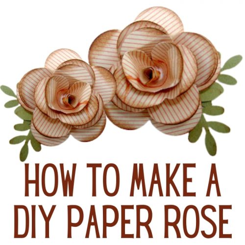
Inside: how to make a DIY paper rose flower for paper crafts When I need a specific embellishment and I can’t find it in my stash I make one this way I always have the perfect embellishment that matches my project in color and size. This is also a great way to use my paper scraps instead of throwing them away. This DIY paper rose technique require the following: 6 petals flower punch Double sided cardstock Leaf punch (optional) Here are three different size punches you can use to make this flower: HOW TO MAKE A DIY PAPER ROSE STEP 1 Punch 3 flowers. If you don’t have the right punch you can print a flower image on the computer, cut it and trace it on your cardstock. Left flower: make a cut from the edge between two petals to the center. Middle flower: cut out one petal. Right flower: …
November 16th, 2012
Hi dear friends! I’m really happy to share my first project with the Susan K. Weckesser DT, a frame I created from Susan’s beautiful papers. When I saw the adorable house on the Live, Love, Create paper it was as if the paper talked to me and I knew immediately what I’m going to create. The colorful house filled me with warm homey feelings and inspired me to transfer these feelings to the wall! I liked Susan’s papers so much I decided to challenge myself to create the frame from the papers only! I covered two sizes of chipboard frames with paper and created a cluster. I embellished it with all kinds of elements I cut from other Susan’s papers and created some of the elements my self. I also used Susan’s Unity stamps to add more textures and patterns. Now all that is left is to add beautiful family photos and hang it on the wall! …
November 14th, 2012
Some people get really uncomfortable when they hear the term white space.Well, there’s nothing to it! White space is just another name for empty or almost empty space on you layout. In order to create a balanced layout some of the page must be empty or almost empty or else we’ll get really dizzy with all the details. This is a layout I created to show that white space is not that scary! As you can see on the layout most of the center is empty, there is nothing on the paper. Some parts of the paper only have interesting background that I made with masks but not a lot more. Even the photos are extremely small and don’t take a lot of space. Here are some tips to create white space: 1. Don’t be afraid to leave parts of your layout with no photos or embellishments.2. Make sure to create a balance between the full parts and the empty …
November 12th, 2012
When I want to create a layout that is both cost effective and beautiful I always use masks. Masks can be used to create a richer background, add layers for more interest and even replace embellishments. In this layout I did all that! I used two of my favorite Crafter’s Workshop masks and added interest to my background as well as a branch embellishment that really pops. When you use masks you can choose the color, you can choose where you want it on your layout and that gives you designing freedom. You can use the mask as many times as you want so it’s cost effective and versatile at the same time! Have fun creating!Einat